Colour Palette
Primary Teal
Accents, buttons, links, highlights
Dark Teal
Headings, dark text, navigation
Warm Off-White
Page backgrounds, subtle sections
Charcoal Black
Body text, primary content
Pure White
Card backgrounds, content areas
Copy 5 main colours as:
Teal
Bronze
Grey
Typography
Merriweather
Usage: Headings (H1, H2, H3, etc.)
✓ Use for all headings and titles
✗ Don't use for body text or long paragraphs
A classic serif font that provides elegance and readability for headings.
Mukta
Usage: Body text, paragraphs, UI elements
✓ Use for all body text and interface elements
✗ Don't use for headings or titles
A clean, modern sans-serif font optimized for readability in body text.
Default Sans-Serif
Usage: Email and limited contexts
✓ Use when custom fonts aren't available (emails, etc.)
✗ Don't use when Merriweather and Mukta are available
Fallback to system default sans-serif fonts when custom fonts cannot be loaded.
Logo Variations
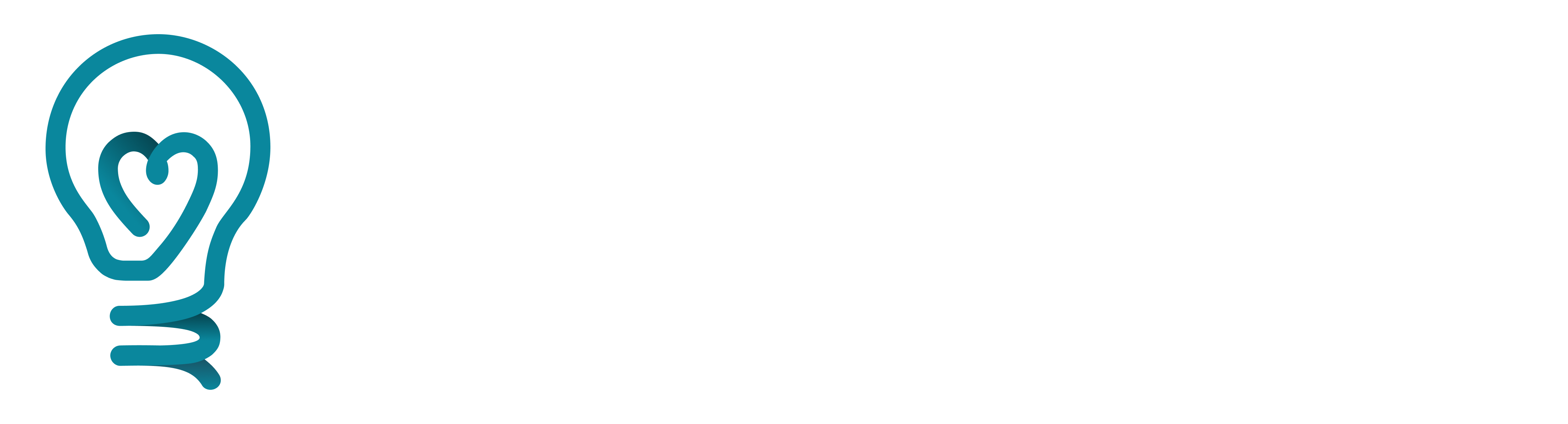
Square logo - Full colour
✓ Primary brand representation
✗ Avoid on coloured backgrounds that conflict
SVG Best for web use, large displays, and anywhere you need crisp, scalable graphics | PNG Best for presentations, documents, and email where compatibility is key | PNG (no padding) Best for tight layouts where you need precise control over spacing
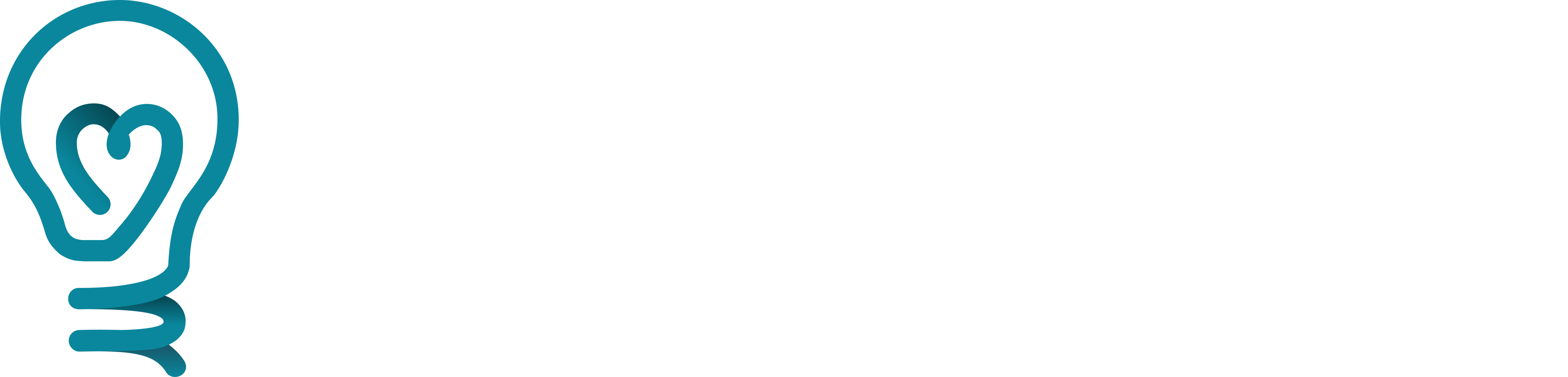
Square logo - Mono colour
✓ Use when displayed in small sizes or when full colour isn't an option
✗ Don't use where full colour is an option
SVGBest for web use, large displays, and anywhere you need crisp, scalable graphics PNGBest for presentations, documents, and email where compatibility is key PNG (no padding)Best for tight layouts where you need precise control over spacing
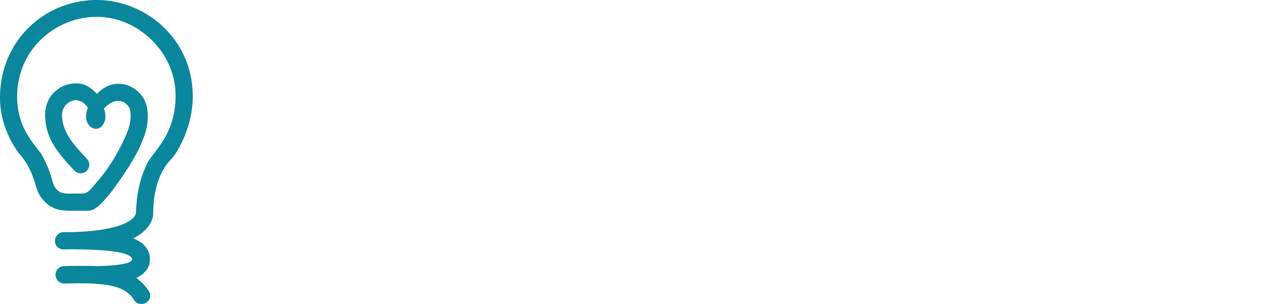
Square logo - Black
✓ Use on light backgrounds where full colour won't work
✗ Never use on dark backgrounds
SVGBest for web use, large displays, and anywhere you need crisp, scalable graphics PNGBest for presentations, documents, and email where compatibility is key PNG (no padding)Best for tight layouts where you need precise control over spacing
Square logo - White
✓ Use on dark backgrounds where full colour won't work
✗ Never use on light backgrounds
SVGBest for web use, large displays, and anywhere you need crisp, scalable graphics PNGBest for presentations, documents, and email where compatibility is key PNG (no padding)Best for tight layouts where you need precise control over spacing
Large Format Logos
Large logo - Full colour
✓ Primary brand representation
✗ Avoid on coloured backgrounds that conflict
SVGBest for web use, large displays, and anywhere you need crisp, scalable graphics PNGBest for presentations, documents, and email where compatibility is key PNG (no padding)Best for tight layouts where you need precise control over spacing
Large logo - Mono colour
✓ Use when displayed in small sizes or when full colour isn't an option
✗ Try to use the full colour version if you can
SVGBest for web use, large displays, and anywhere you need crisp, scalable graphics PNGBest for presentations, documents, and email where compatibility is key PNG (no padding)Best for tight layouts where you need precise control over spacing
Large logo - Full colour dark
✓ Use for large displays on dark backgrounds
✗ Don't use on on light backgrounds or in small sizes - the gradient on the bulb will get lost in the background
SVGBest for web use, large displays, and anywhere you need crisp, scalable graphics PNGBest for presentations, documents, and email where compatibility is key PNG (no padding)Best for tight layouts where you need precise control over spacing
Large logo - Mono colour dark
✓ Use for smaller displays on dark backgrounds
✗ Don't use on light backgrounds
SVGBest for web use, large displays, and anywhere you need crisp, scalable graphics PNGBest for presentations, documents, and email where compatibility is key PNG (no padding)Best for tight layouts where you need precise control over spacing
Environmental Logo Variations
Square logo - Full colour
✓ Primary brand representation
✗ Avoid on coloured backgrounds that conflict
SVGBest for web use, large displays, and anywhere you need crisp, scalable graphics PNGBest for presentations, documents, and email where compatibility is key PNG (no padding)Best for tight layouts where you need precise control over spacing
Square logo - Mono colour
✓ Use when displayed in small sizes or when full colour isn't an option
✗ Don't use where full colour is an option
SVGBest for web use, large displays, and anywhere you need crisp, scalable graphics PNGBest for presentations, documents, and email where compatibility is key PNG (no padding)Best for tight layouts where you need precise control over spacing
Square logo - Black
✓ Use on light backgrounds where full colour won't work
✗ Never use on dark backgrounds
SVGBest for web use, large displays, and anywhere you need crisp, scalable graphics PNGBest for presentations, documents, and email where compatibility is key PNG (no padding)Best for tight layouts where you need precise control over spacing
Square logo - White
✓ Use on dark backgrounds where full colour won't work
✗ Never use on light backgrounds
SVGBest for web use, large displays, and anywhere you need crisp, scalable graphics PNGBest for presentations, documents, and email where compatibility is key PNG (no padding)Best for tight layouts where you need precise control over spacing
Environmental Large Format Logos
Large logo - Full colour
✓ Primary brand representation
✗ Avoid on coloured backgrounds that conflict
SVGBest for web use, large displays, and anywhere you need crisp, scalable graphics PNGBest for presentations, documents, and email where compatibility is key PNG (no padding)Best for tight layouts where you need precise control over spacing
Large logo - Mono colour
✓ Use when displayed in small sizes or when full colour isn't an option
✗ Don't use where full colour is an option
SVGBest for web use, large displays, and anywhere you need crisp, scalable graphics PNGBest for presentations, documents, and email where compatibility is key PNG (no padding)Best for tight layouts where you need precise control over spacing
Large logo - Full colour dark
✓ Use for large displays on dark backgrounds
✗ Don't use on on light backgrounds or in small sizes - the gradient on the bulb will get lost in the background
SVGBest for web use, large displays, and anywhere you need crisp, scalable graphics PNGBest for presentations, documents, and email where compatibility is key PNG (no padding)Best for tight layouts where you need precise control over spacing
Large logo - Mono colour dark
✓ Use for smaller displays on dark backgrounds
✗ Don't use on light backgrounds
SVGBest for web use, large displays, and anywhere you need crisp, scalable graphics PNGBest for presentations, documents, and email where compatibility is key PNG (no padding)Best for tight layouts where you need precise control over spacing
Impact Icons


Bad Examples — What NOT to Do

Mistake #1
✗ Stack the text next to the logo
✓ Use standard logo with two lines of text

Mistake #2
✗ Centre-justify the text next to the logo
✓ Use standard logo with right-aligned text

Mistake #3
✗ Use other fonts with the logo
✓ Use Merriweather font

Mistake #4
✗ Awkwardly space the icon and text
✓ Use the logos above as a reference

Mistake #5
✗ Squeeze the text in too close to the logo
✓ Use the logos above as a reference